Tradebook App
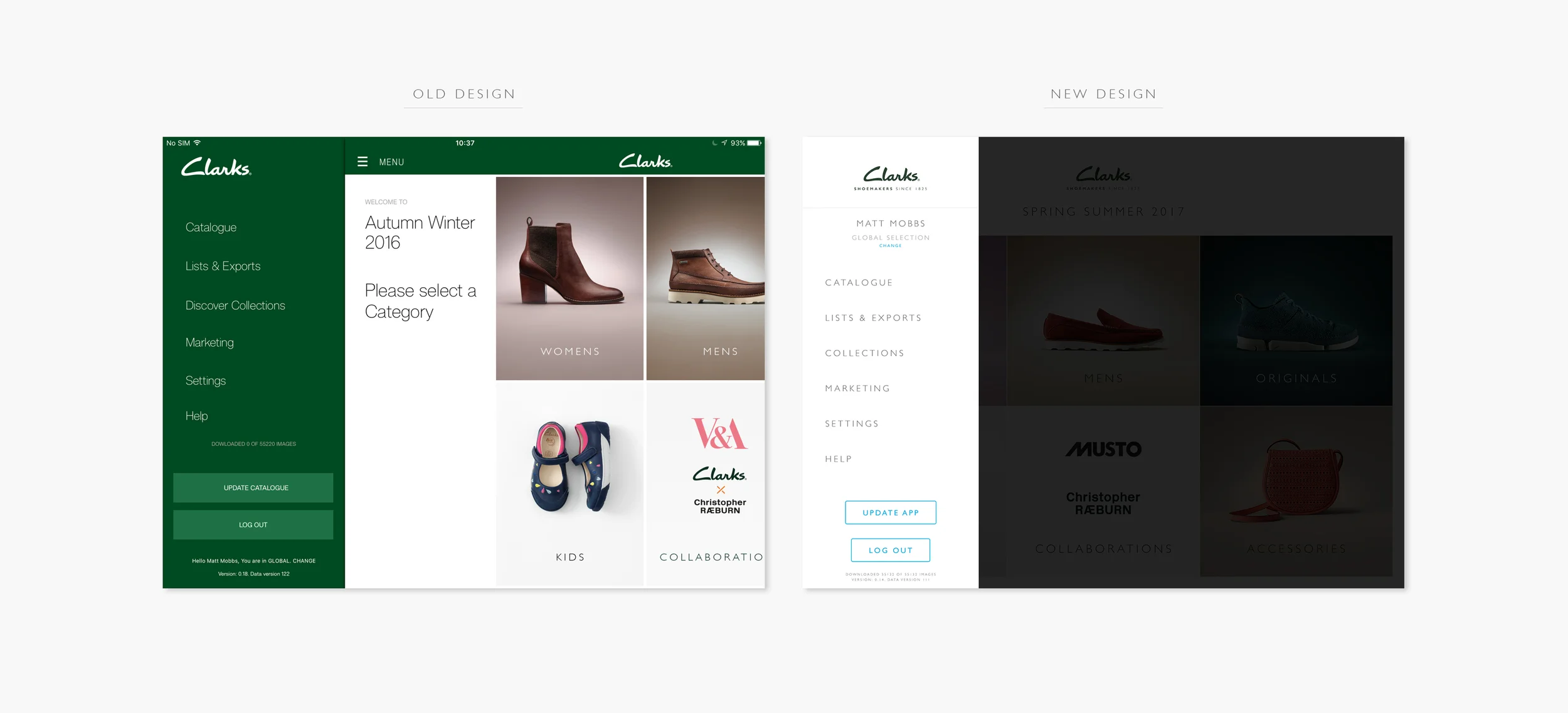
The Tradebook App is part of what the Clarks sales teams use at any sales conference to help other businesses with their orders. the current design had gone down well with sales teams but lacked any official branding. The brief and business objective was to update the App giving it a fresh feel and have it on brand with how the company is going.
Initially the project lead asked me to just reskin the old version, to which I did but having looked through the app, I had noticed some pages were very un-user friendly and required more than just a reskin. Speaking to the lead, we found budget for certain pages and features to get changed and added.
Below you will see just a handful of pages that were reskinned.
Some of the features I added allowed the user to access their List or the Menu from any page, by either swiping right to left or left to right receptively. To go back, the user needs only swipe up from the very bottom.
Underneath that is an example of one of the pages that got a full overhaul making it easy to use. The example is the product page. On the old version, the user would have only the very bottom part to scroll through all the other colourways and to see its respective information. This didn't make much sense to me when simply making the page longer and giving everything respect on the page would solve the problem.
To view a prototype of the App, please click here: https://invis.io/4X6KQVSYU


